In the world of marketing and designing; color is the silent ambassador of your brand. The way a logo tells a story about a brand, similarly the color of the brand also represents its ethics and what it stands for. Every color is known to have its meaning and reflects the property it stands for. According to its meaning the color sends a broader messaging patterns, which forms a perception among people. In marketing, a color plays one of the important roles in influencing the consumer to buy a certain product. When it comes to branding the role of the color hinges on the perceived appropriateness of the color being used for the brand.
The primary concern is that does the color “fit” what is being sold? Somehow, colors influence how customers view the personality of the brand and affects their decision to shop or take a service as well. Some studies also add to the fact that the brain prefer immediately recognizable brands, which makes color an important element while creating the identity of the brand. And for a new entrant in the market it is important to differentiate their brand from the competitors.
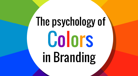
Let’s have a look at some of the pointers that will help in understanding the psychology of brands and colors.

Gender Color Trends
When it comes to men and women they have their specific color needs and choices. Moreover, one’s perception and cultural perception plays a strong role in dictating color appropriateness for gender, which in turn can influence individual choices. So, it all comes down to how people react in different cultures and react to colors.
Color coordination and conversions
According to psychology, there is a principal known as Isolation Effect, which states that an item that “stands out like a sore thumb” is more likely to be remembered. You can utilize background, base, and accent colors to make impact with the color of your brand.
Color Combinations
When it comes to choosing colors; the color wheel can help you in choosing great color combinations to come up with your own view of the brand. Keeping the color combinations simple in the long run will help you to make an impact on your customers.
Let’s have a look at hoe brands are using this psychology.
![]()
Red and Yellow are the colors of McDonald’s. The basic reason to go for these colors is because they are most appealing to children. Red is also known for increasing appetite and to create a sense of urgency, thereby getting customers to order in a hurry and leave faster. Yellow is the color of cheeriness and optimism, and the trademark “M” used by McDonald’s creates an atmosphere of positivity about the brand as seen in their tagline of “I’m lovin’ it”.![]()
Starbucks is the only top global brand which uses green as it’s primary color. The Mermaid Logo is also said to stimulate the customers associations with nature. The green color promotes a sense of relaxation, inviting customers to take a coffee break and de-stress.
![]()
The Orange color is cheerful and warm, and also draws in impulsive shoppers who are attracted to bright colors.
Having a color complementing the personality of your brand is important to let your customers know what you stand for and how they have to perceive your brand. Connect with your customers personally as the psychology of the color relates to the theory of persuasion.