
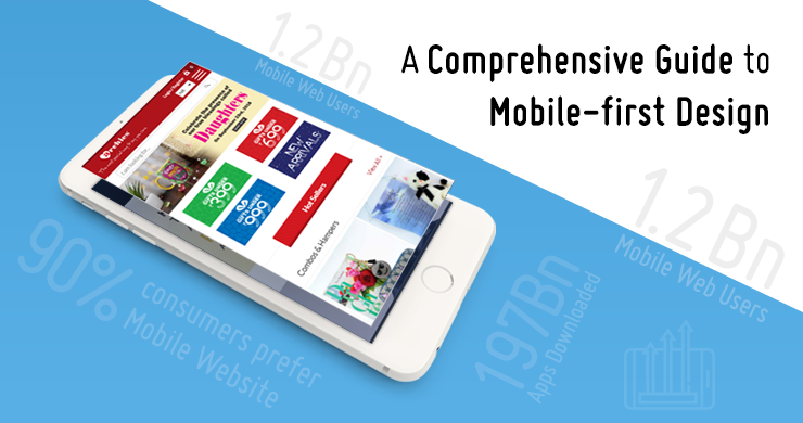
In 2010, GSMA organized Mobile World Congress under the theme “Vision in Action,” with visionaries talking about the insights of upcoming technologies and what entrepreneurs should focus on developing to make technology even more user friendly. Eric Schmidt, then the CEO of Google in the same event put forward a thought for designers to follow the ‘mobile first’ rule in product design.
Later in 2011, Luke Wroblewski invented the concept of mobile first design which took the world by storm and broke all the internet conventions. If we look back 7-8 years, this concept was not very much understood by the designers. The aesthetic of designing a website was from a wider screen and then degrading the screen sizes. But as the years have passed by and more and more usage of smartphones is coming into action, it has been proved that applications on smartphones drive approximately 60% of top site traffic and more business than ever. It is also said, a person spends at least 5 hours a day on its smartphone and the majority of time is spent on applications and websites. With such a boom on internet in today’s time, it has become important for designers to change their plan of action and start with mobile- first design. Let’s understand, what do we mean by mobile first design?
Contents
What is Mobile First Design?
It is exactly what it sounds – Starting from the smallest screen till working your way to the largest screen. Mobile first design strategy is adapted for a responsive or adaptive design. Since the approach is designing from the smallest screen to largest, the design will only have the necessary features, which help in reducing the risks of losing the core message and functionality and it ensures a great user experience. With such a wave of mobile first design and designers adapting this technique, Google is also now using the mobile-friendliness of a website an aspect of ranking signals and penalizes websites that aren’t optimized for smartphones and tablets.

Image Source- ClickDealer
Importance of Mobile- First Principle in Website/Application Design
Below are 5 reasons and statistics to make you believe that smartphones are not a trend but they are here to stay for very long. Have a quick look at the pointers below:
- As of this year, there are 1.2 billion mobile web users across the globe!
- Total number of applications downloaded in 2017 was 197 billion!
- In the Asia Pacific, the smartphone revenue has been amounted to $86.9 billion in 2017 than it was $61.9 billion in 2013
- According to Forrester Research, with a well-designed user interface one can raise its website’s conversion rate by 200% whereas, a better UX design can yield conversion rates by up to 400%
- 90% of consumers prefer using multiple devices to visit the website.- Google and IPSOS
Features of Mobile-First Design
- Mobile-first design is a Canon of Progressive Enhancement– Designers have an ideology that mobile design is the hardest and thus should be done first. Once the necessities of a mobile design are answered, incorporating additional features and animations on wider screen becomes a cakewalk for designers. The crux of everything is that, the smallest screens will only have the essentials features that are designed keeping at the heart of your UX.
- Graceful Degradation- The Opposite of Outlook- To explain it in simple words, it is approached by starting the design for the widest screen size and eventually adjusting it to the lower screen size. It is basically an invitation to all the complexities right from the start and then treating mobile design as a ‘cutting down experience’. The complication with graceful degradation is that while building all-inclusive design from the scratch mergers the core and supplementary elements and it becomes hard to distinguish and separate the elements.

image source- friday.ie
Benefits of Mobile-First Design
To start with, mobile-first design increases the possibility of more profit for your business and now that Google is also keeping an eye on the mobile-friendliness of a website for rankings, it makes sense to think about it before starting a new project. More than that, with the minimum features and elements the page will load faster and benefits the download time while the user is accessing your content. A second of delay is causing a 7% loss in conversion , mobile-first design can help you avoid that loss.
The approach of Progressive Enhancement sets a strong foundation for designing and then adding enhancements as you go up. This foundation will help you strengthen designs for tablets and desktop views. Speaking about foundation, content is the key to developing mobile-first design. They should go hand-in-hand because for such designs, a user would only need information that they would need to see and nothing more than that.
Through mobile-first design you are forced to focus only on the essentials and remove any unrequired user interface decoration. This also makes good business sense and invariably improves the user experience.
Procedure for Mobile-First Design
- Content Inventory- Start with a spreadsheet containing all the elements that you wish to include in the design. You can refer to the image given below.
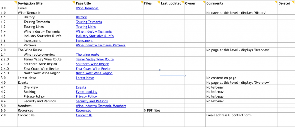 Image source- Maadmob.com.au
- Visual Hierarchy- After having everything in the content inventory it’s time to prioritize the elements that will have room in the mobile-first design and how will they be displayed prominently.
- Design the Smallest and then Scale up- It is important to build a mobile wireframe first and then use that model for larger breakpoints. If you feel that there is more white space than needed, you can always expand it as per the requirements and space
- Enlarge Touch Targets- Pixel precise mouse cursors are not sufficient for a good UX. Give much room to fingers and thus your designs would need large elements on which to tap. For example- Apple recommends 44 pixels square for touch targets. Enlarge the buttons. Let hyperlinks have plenty of space.
- Don’t be Dependent on Hovers- Hovers are to go for wider screens and we know as a designer you mostly rely on hovers and mouse effects to make the design look more adaptive. Hence, for fingertips stick to touch as there is no hover control for finger tips.
- Ponder ‘app’- Mobile users are familiar to motion and little bit of control in their experience. Think about off-canvas navigation, expandable widget, AJAX calls, or other elements on the screen with which users can interact without refreshing the page.
- Say a Big ‘No’ to Big Graphics – A screen of few inches cannot apprehend larger images or complex graphics. Use images that are user friendly and readable on handheld screens.
- Test it in a Real Device- Just like you put a vehicle into the final tests before launching it, discover your design on a real gadget and see if this is usable and step away from the wider screens. Observe every inch of the design navigate through all the pages and see the scope of improvement. Is the load time appropriate? Are the texts and graphics easy to comprehend?
Tips
It is expected that by 2020, the global smartphone user base will reach about 6.1 billion, giving it a boom of 3.5 billion since 2014. Hence to be ready for such a mobile user base, your website needs to be ready. Here are some tips to make your website more mobile-friendly:
- Declutter the Clutter – Too much of information in a small screen will confuse the user,resulting in user bouncing off the site. Too much of information, icons, images or buttons makes the screen more knotty and the essence of the website is lost. Use the technique functional minimalism to solve the problem of clutter for a better UI. There are three aspects of functional minimalism:-
- Keep the content crisp and direct, present what the user would want to read.
- Keep the interface elements as minimum as possible. A simple design will keep the user engaged with what is required.
Image Source- Apple
- Use the technique of progressive disclosure for options that are required but cannot be shown in a single design.
- Offload Tasks – Tasks where user efforts are used like entering data or making a decision make them abandon it. The solution to this is finding alternatives. For instance, use the previously entered data instead of asking them to re-enter. Or you can set already available data as the default information.
- Let the Design be Consistent – Visually, functionally and externally speaking, letting your design be consistent makes it more appealing and leaves no space for confusion. Keep your buttons, labels and elements same in every page. This helps the user in using the application better.
- Optimize Your Speed – Now that Google has already made page loading speed as a ranking factor for mobile searches, it’s time to implement various techniques to boost your page loading. Install a caching plugin, CDN or switch to HTTPS for better response of website which speeds up the page loading. Also you can optimize images and use lazy-loading to deliver images without slowing down the website.
- Simplify the Navigation and Interactions – Use a hamburger menu for a larger navigation menu and keep in mind that users tap on links and swipe the screen to interact with the website. So make sure you optimize your website’s interaction accordingly.
Examples of Excellent Mobile-First Designs
There’s always someone or something that inspires us to make things right. Likewise, in the internet space there are many websites that are best examples of mobile-first designs and they raise the bar/standards for other websites. Here are some examples of excellent mobile-first designs for inspiration.
- YouTube
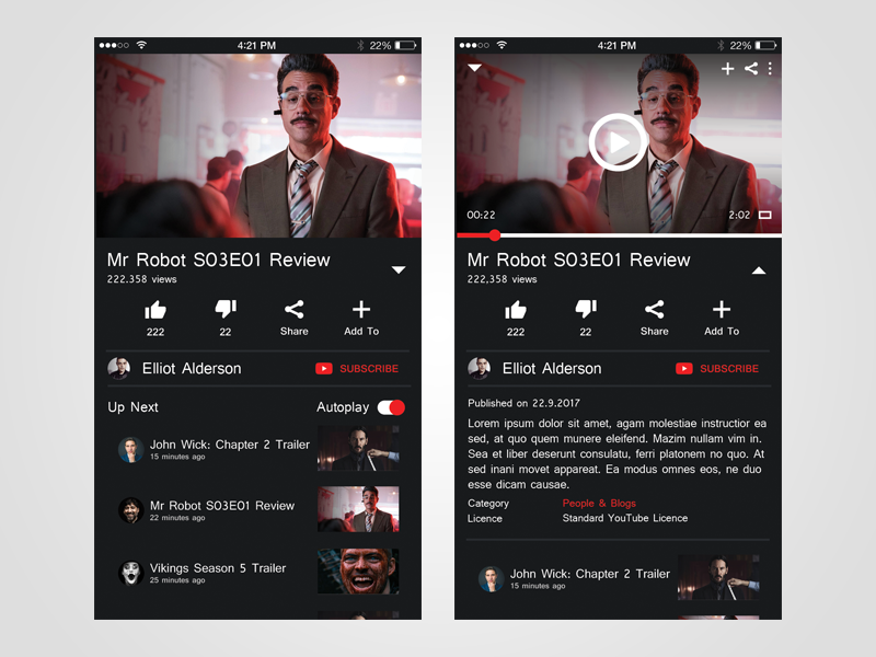
Source- mockplus.com
One can see that the Material Design language that users observe in the desktop version has also been the preference for mobile devices. The text size and button display on the web application helps adapt the users’ habit of touch on small screens. Moreover with the dark theme, Youtube depicts its preference for mobile web users. With the night mode on in smartphones, it’s better to use the night mode screen rather than the black and white background. Small screens with no colors flashing in users’ eyes. A big thought by Youtube.
- Apple
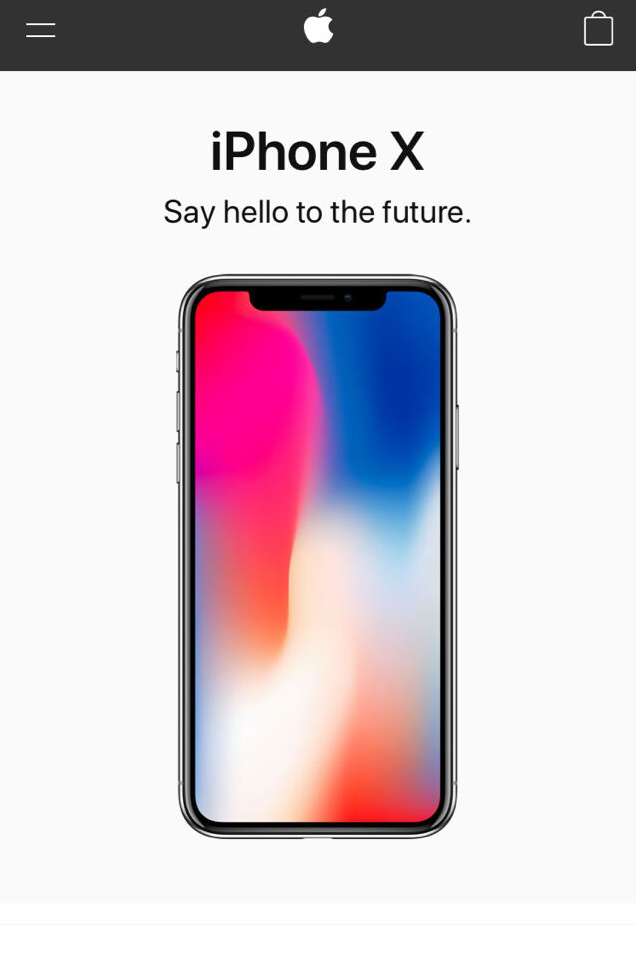
Source- mockplus.com
Irrespective to the seamless design that Apple has for its desktop and mobile web users, it has a marvelous content layout which makes it effortless for the users to search anything very conveniently. The users don’t need to tap on the navigation button to have access to the information. But they can scroll down the page and access all the information. The cart or the shopping bag icon should be prominent for the user’s to see at first glance.
- Airbnb
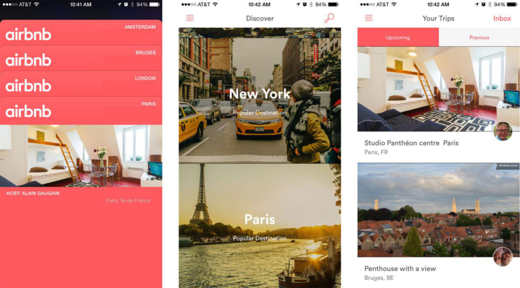
source- mockplus.com
Card designs make it easier for users to have important information on a single screen. Once landed on the webpage, the gets the right information in a clear manner which results in better user engagement and connect. The message on the card design is concise and effective, usually consisting of a text, image or a graphic.
- Google Maps

Source- hubspot.com
With totally similar to the application experience, the mobile web design of Google Maps is virtually indistinguishable. Not only the appearance is identical but the speed and functionality is the same as of the application.
- Evernote
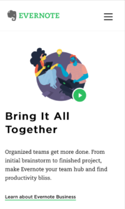
Mockplus.com
The clean and fresh mobile UI interface of the design gives it a revival transform which is a need for Evernote because of the obvious reasons. Moreover the right Call To Action button is very useful on the web which Evernote has clearly taken care of.
Looking forward to get a mobile-first website/application built? Talk to our design expert on +91 9810619956 or email us at info@finessse.digital or just check out our web/mobile design service page to know more.